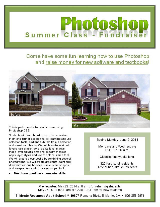
- Description: This is a flyer for a Photoshop class that I will be teaching in the summer. I created it and then found out that it was supposed to be a fund raiser. After texting our teacher, she told me that I could turn it into a fund-rasier. This was done with Microsoft Word program.
- Process (Programs, Tools, Skills): I scanned in the images from an exercise in the
Photoshop Book that I teach from. The original pictures showed a picture of a cyclist and then a cropped picture with a formatted edge that looks like a frame. My daughter told me that those pictures wouldn’t interest her in the class because she could do those things on her phone. So I found another exercise in a previous book that you see above where we bring in other images and use other tools to do the landscaping for the house. This is a better example of something that can be done in Photoshop. I also changed a few other things based on feedback that I got from the critiques. I chose the green color because it went well with the first pictures that I used; I decided it looked good with these pictures too. I liked the white contrast and thought it had a summer-like feel to it. I like the repetition and contrast of the white boxes. I like the contrast of the heavy
Britanic Bold font and the Arial font for the rest. I tried using a serif font for the body copy and didn’t like it as well. - Message: I think the message Photoshop grabs the attention because it is placed in the upper right corner and uses an eye-catching font as well. Then the subtitle is in a
different font and is spread out so that the white space also attracts attention that it is a fund-raiser. Below that we see what the money raised will be used for. In the smaller box towards the bottom we find the date, time, duration of the class and the price of the class.
- Audience: The audience is adults over (18 years and older), male and female.
- Color scheme and color names: This is a monochromatic color scheme using shades of green and white
- Top Thing Learned: I prefer doing my layout in InDesign where I have guides etc. I was already familiar with the design tools in Word, they keep adding more and more options for changing photos in Word. It’s great to know if you are working on a computer that doesn’t have the Adobe programs.
- Title Font Name & Category: Britanic Bold, Modern
- Copy Font Name & Category: Arial, San Serif
- Scanned images used, sources, original sizes, location of scanner used: I scanned the images from a book, “Photoshop CS4 Comprehensive Concepts and Techniques”
(I used a newer book for the original pictures and this book for these pictures). These pictures were origianally 1369 x 949 px and 1369 x 936 px. I used the scanner at my home which is an Cannon MP 170.
You can see my video here: https://www.youtube.com/watch?v=lmSsjAHMhlY
I really like the color you have in your flier, the green is really calming. I also like how you broke up the information so it was not too intimidating. I wish there was a little more white space, though. I know it was hard because your really had a lot of information to convey. Good work though! http://sianmccuen.wordpress.com/2014/05/17/p2-event-ad/
I love the flier. I really like the color scheme you used. I think it goes well with the pictures. I also love how you put the register information in a box with a bold stroke line around it. It really stands out and makes that important information easy to read. Here is a link to another great blog event ad: http://comm130wademitchell.wordpress.com/2014/05/17/project-2-event-ad/