
Ad Strengths?
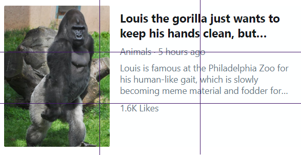
This ad really got my attention. The picture for one, and then when I read the headline, it was so intriguing that I had to click on it and watch the video. This ad was on Twitter and it was promoting the video about this gorilla that walks like a person. I think that the headline not being complete and using the … to make us want to know how they finish and what it has to do with the gorilla keeping his hands clean.
Ad Weaknesses?
The only weakness that I might possibly see is that it is not exactly centered on the intersection of the Rule of Thirds. (I don’t know, maybe its a grid instead?) I really don’t see that being a problem though and I really like it.
What is ad trying to accomplish with its design?
This design is trying to catch our attention and draw us in so that we will watch the video. It was obviously very successful. This looks like the Rule of Thirds to me. The image takes up approximately the left third and the text takes up the right two-thirds. The headline takes up the top third with the description taking up the middle third. I like the gorilla facing the text; it looks like he might just walk right through the text, showing us his “human-like gait.” The hierarchy works well in both size of font and color. I am attracted to the image and then the headline which is in black and larger and then down to the description which is gray and smaller.
Metrics?
The number of clicks to watch the video would show success. Also the number of likes and retweets would show success. This one has had 1.6K likes which sounds successful to me.
