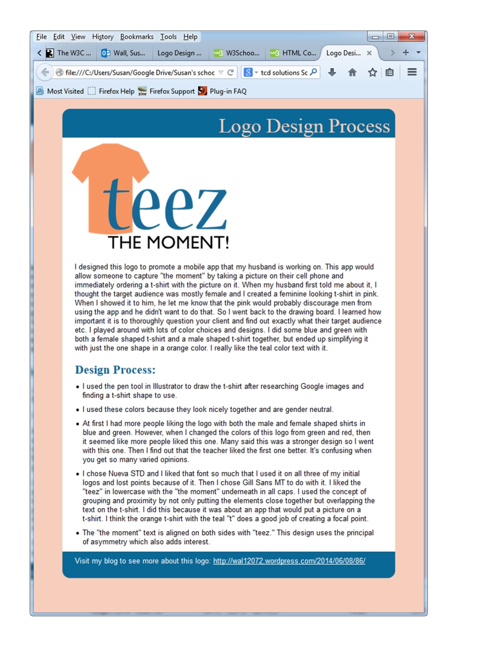
Description: This is a webpage detailing the design process for my logo project. We learned a little bit of HTML and CSS.
Process (Programs, Tools, Skills): I used Notepad++ to do this project. I have used it before and am somewhat familiar with HTML and CSS. I inserted my logo image into the html. I wrote a paragraph about the scope of the project and the process of picking the colors. I created a bulleted list outlining the steps of the logo creation. Then I opened my logo in Photoshop and used the eyedropper tool to find out what the hexadecimal codes were for the colors. I tried to use the same orange on the background, but it did not look good and detracted from the logo being the focal point, so I found a lighter shade that I think looks nicer. I decided that I wanted to repeat the blue bar at the bottom, so I persisted until I figured out how to change the CSS and make it work. I decided to use the sans-serif font for the body and the serif font for the headings. I liked the white font for the h1, but the instructions said to change it so I changed it to the same peach color that I used for the background (even though I like the white better). We were given the CSS code and changed various elements in it to customize it. My word count is: 429 words.
Message: The message is about how I designed my logo for the web app that my husband is working on.
Audience: The audience is my teacher and classmates. I really don’t think anyone else particularly cares about the design process of my logo.
Top Thing Learned: I figured out how to duplicate the blue bar at the bottom of the page. It was a little challenging, but I finally made it work.
Color scheme and color hex: Complementary color scheme; #f7cebc and #096895
Title Font Families & Category: Times New Roman, Georgia, serif; Serif
Copy Font Families & Category: Arial, Helvetica, sans-serif; sans-serif
Changes made to the CSS: I changed all the required things: The h1 text color & background color, font colors for the paragraphs & list items, the background color, Font Families and I add at least one css comment. I also changed some padding etc. The main change that I made was to add the footer similar to the H1 background, but change it for the footer:
.footer {
font-family: Arial, Helvetica sans-serif;
font-size: .9em;
font-weight:normal;
text-align:left;
padding: 10px 25px 25px 25px;
background-color:#096895;
color: #FFFFFF;
border-radius: 0px 0px 15px 15px;
-moz-border-radius-bottomleft: 15px;
-moz-border-radius-bottomright: 15px;
-webkit-border-bottom-left-radius: 15px;
-webkit-border-bottom-right-radius: 15px;
}
I also changed the border of the body to transparent so it would not show.
Link to my video displaying my print quality: https://www.youtube.com/watch?v=C6gOdeZYK_U
Great job on your web page! You did a great job coordinating the colors with the logo. You are really getting far along with your business and it has been great watching your logo develop as well as your web page.
Here is my link my blog post:
http://maryjillpeterson.wordpress.com/2014/06/29/p7-mary-peterson/
Great job Susan. I think you used great choices for your fonts and your color scheme. It seems that every element works well together to display a certain message to your audience. I think the background color that you chose is so appealing in connection with the rest of the designs. Using warm colors and contrasting values I think you were able to convey a particular message. If you want to check out my designs go over to http://jackynorthgrave.wordpress.com/